Showing posts with label art. Show all posts

Thursday, June 25, 2015

CHRISTOPH NEIMANN: SUNDAY SKETCHES


Christoph Neimann.

This is wildly imaginative stuff. Call me a fool, but I thought the bottom image was an actual camera.

See more here.


Thursday, June 18, 2015

ONDINE AT SUTRO BATHS

IMG_0102


In San Francisco news, I recently saw the play Ondine at Sutro Baths, next to the Ocean. The play chronicles the love between a mystical ocean creature and a knight. It takes place in the open air next to the water, and you get to move from setting to setting along with the cast. It's freezing and wonderful.

These aren't pictures from the play itself. But in between location changes, cast members drape themselves artfully into the landscape for you to walk watch and admire. They also serve you meringues. It's one of the most unique experiences I've had in a good while.  

More information here.

IMG_0109

Thursday, January 29, 2015

THE MESS PROJECT POSTERS

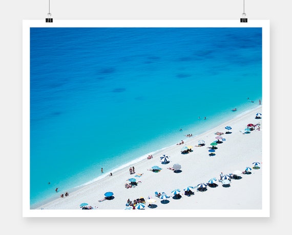
Lefkada Greece
More art. The world needs more art. So I went and found some from The Mess Project on Etsy. On top we have Lefkada Greece, followed closely by Love and Just Friends.


Wednesday, July 30, 2014

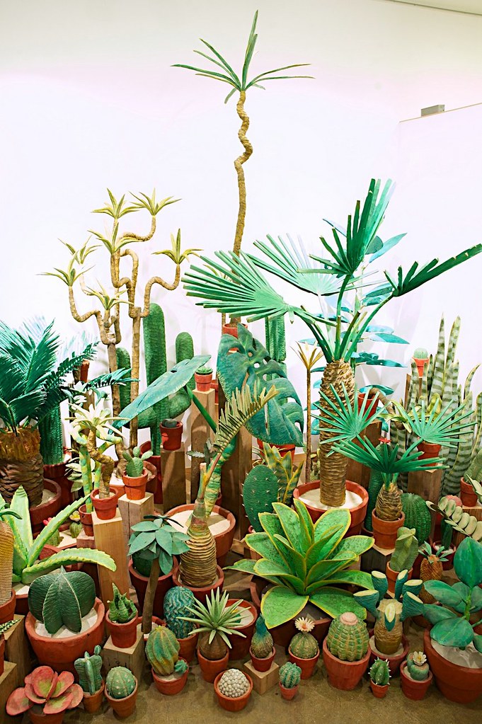
HAND CARVED WOODEN HOUSEPLANTS BY YUTO YAMASAKI

yuto-yamasaki-1
Spoon and Tamago

I have a black, black thumb. If you've heard of a green thumb, then you should know that there exists the reverse: the black thumb that leaves a trail of quaking plants in its wake. What to do? Cactuses? Succulents? How about air plants? I've killed two out of three.

Here is another option: hand carved wooden plants by Yuto Yamasaki. If I hadn't said anything, you would have thought they were real, eh?

Read more here

Friday, July 25, 2014

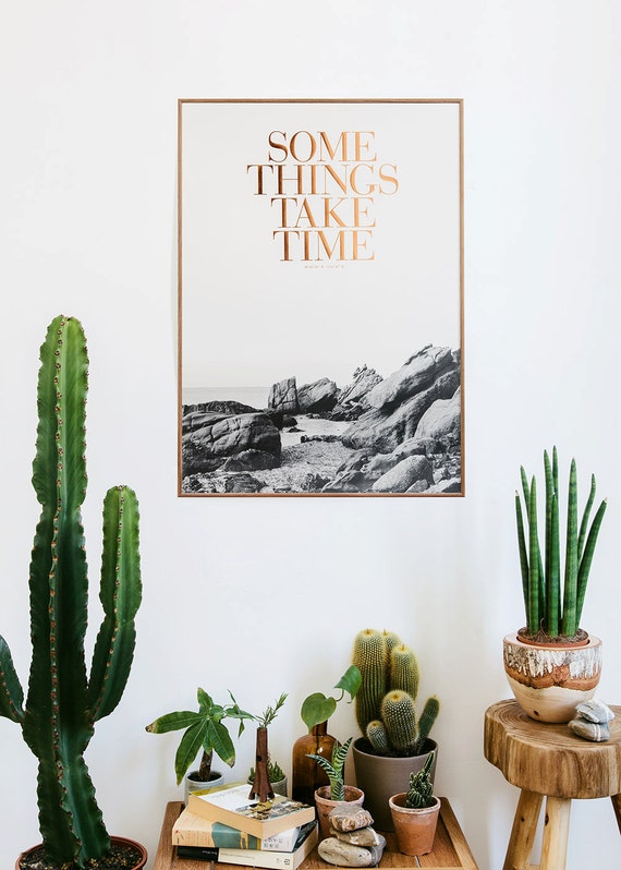
ART PRINT

Etsy
Here's a lovely print from CongoStudio at Etsy. Love the gold set against the black and white.

Wednesday, April 30, 2014

STUDIO KMO

Etsy
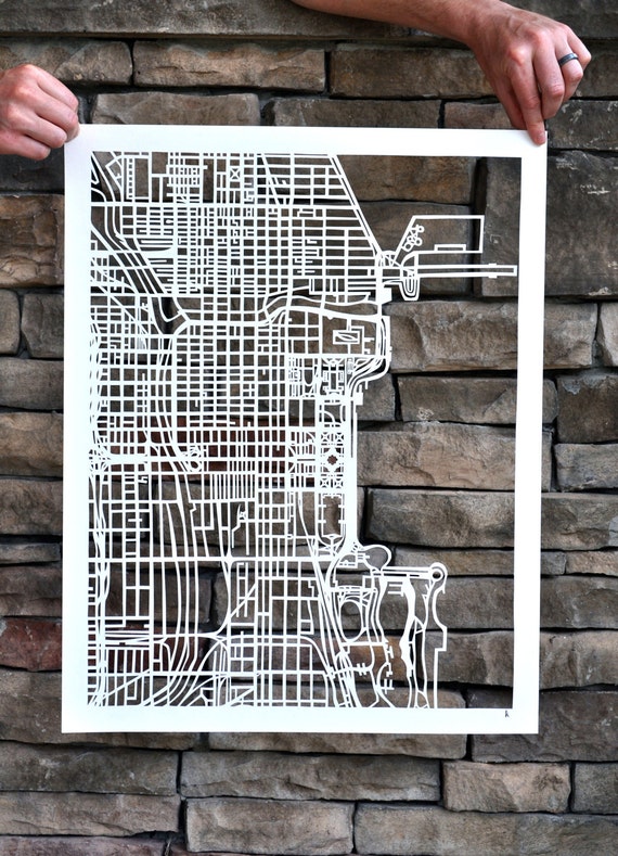
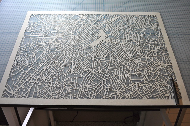
Steady and methodical. That's what these maps make me think of. Sometimes, when you look at a piece of art, you can see the process laid out for you. What I see is a steady series of very precise movements. The effect is strangely calming. For me, at least. 

Karen O'Leary cuts each map by hand, and sells them on Etsy. They're beautifully done. Precise. Geometric wonders. 

Untitled

Friday, April 25, 2014

WEEKEND DIY: ART

Image via 79 Ideas
I really like the idea of this: to just take a regular image, any image - the more boring the better - and to put it through a filter to smear away any crispness, so that in the end, there is a kind of mystery there. One which only you can solve. 

Friday, February 21, 2014

DOUBLE EXPOSURE PORTRAITS BY ANETA IVANOVA


Just when I think there's nothing else that can be done in the world of photography, I came across these double exposure portraits by Bulgarian photographer Aneta Ivanova, and the world of what was possible opened up just a crack more.

You can find more of her work here.

Friday, February 14, 2014

WEEKEND DIY: SHELVES EDITION


Via Rue Magazine
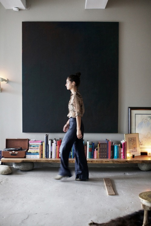
The obsession officially began when I saw the image of that complete stranger walking across her low shelf above. It seemed a perfect solution to a multitude of shelving quandaries - namely how a lot of shelves can be ugly. No offense to shelves. But...where would I find two large rocks like that, and how could I make them the same height? I had images of myself sanding rocks late at night, and it wasn't ideal.

Then, I found a much more reasonable DIY below. It's such a simple idea really: balance a refurbished plank of wood on top of a stack of magazines, and then you can have a shelf. Perfect.  
Image via Tumblr


Friday, December 27, 2013

DESCENT INTO SLOTH

The Friendship Between a Girl and Her Cat
It's that time of year, and I feel I've done a great deal, so I'm going to relax and post content that earlier...let's say that earlier in the year, I was trying for higher standards, intellectual wit and whatnot, and right now...my brain just feels like looking at cats. You can click on the link for more pics. Go ahead, I dare you. I will now go read some Nabokov.


Tuesday, December 10, 2013

ARTIST JEEYOUNG LEE

Image Via
So, I like to take photographs, you know, because it reflects reality through the filter of my lens. The camera is a way to see the world through my eyes. I also like to have an imagination, which is a colorful place, frequently surreal, and which I touch upon to tell stories. Never the two shall mix.

Then I came across JeeYoung's photography, and she quietly blew that distinction to hell. These are actual photographs that she takes, of settings that she has created. In real life. When reality isn't photogenic enough, she takes the time to bend it to her will. There's a lesson in there somewhere. 


Monday, October 14, 2013

A WELL DESIGNED BOOK COVER

Via
I don't own this book and I've never read it. I'm sure it's good. Amazon seems to like it, but that's not why I'm talking about it. I know you shouldn't judge a book by it's cover but seriously, just look at it. Just look. It's beautiful. I found this on a design website because she thought it was beautiful. Again, neither of us was talking about content.  The yellow is striking and inviting, the writing is in a personal script, and the juxtaposition of freehand script against a geometric book pattern is simple, minimalist perfection.  

What struck me is how fresh and modern this cover is; this is a deliberate and calculated choice, as all covers are, and I believe that it works. By "it works," I mean that it will make a reader curious about the book, to want to take a peek inside, and sometimes that little push is all you need.

This cover would look beautiful hanging out on your desk or on the face of your iPad. I am by no means a book designer or cover artist or whatever the official title may be, but this is something worth considering, yes? 

Wednesday, September 18, 2013

ARTIST TAY DALL

Via
This caught my eye recently.  From artist Tay Dall, she hails from South Africa.  There's a lot of control and balance to her work right here, the way the colors touch each other, the precision of her shapes that aren't exactly shapes. The closest analogy I can make to this is that it's like writing about someone who has gone mad, you can't just have the character go completely crazy, that means you have no control over your work and it's sloppy. You have to give the crazy a framework where it can function. 

I've tried painting approximately twice in my life, and realized both times that I don't have it in me to create anything using this medium, but it does give me an appreciation for good technique when I see it.* I tend toward abstract subjects.  Does this do anything for you?

*General disclaimer: I have yet to master the use of liquid eyeliner, so that should give you an idea of the level of skill I'm working with here. The need for eyeshadow is also rather mysterious to me. I've only ever tried it on Halloween, where you can pass off mistakes as "part of the costume, obviously."

Monday, September 9, 2013

EASY DIY: LARGE TEXTURED CANVAS

Via
I saw the above image in the home of designer Barbara Gongini, saw that picture of her bedroom (?) and stopped to stare.  There are actually two ideas going on here.

1) Take a large canvas and just brush paint unevenly over it using one principle color (red, anyone?), this will add a strong shot of color to any room, and you can casually lean it against a wall or put it behind furniture to lessen the impact, depending on what you want.  The easy factor comes from the fact that the paint job should be imperfect, it should not be flat or even in any way - I should mention that you definitely should use a hand brush and not a roller if that's not obvious - or it will be boring and flat.

2) The second (but not the last) bit of genius in this room is in her use of a floor lamp to hang a decorative object.  I would suggest a small mobile, since there is never any normal place for those things to go, unless you're a fan of low ceilings.

Some other details of note: the glossy white floor and the textured cream walls in the background.  This perfect neutral backdrop becomes a perfect forum for furniture and art to pop.
Wednesday, August 21, 2013

THE TECHNIQUE OF WRITING: CARTOON-STYLE

Via
Did you notice the unicorns?

For some reason, I found this strangely motivating. If you had it in the background somewhere - either in the back of your mind or on your laptop desktop, it's all good - you would find yourself wanting to make something.  Sometimes it's odd what inspires that creative process.  A lot of the time, it's when I allow my mind to relax - then the ideas come easily.  

They're on the bottom left.  That pair.  Wait...I think only one of them is mythical, so it's cross breeding.

Wednesday, August 7, 2013

WATERCOLORS AND TEXTURE

1
2
3
4
That last print spells unconscious. 

The top two prints are by Daniel Egneus and the bottom two are by Sprios Halaris.  I am not a follower of art; I don't know these men from Adam, but I dabble in the art of browsing.  In my second job as an online browser, I have discovered Arte Limited, which has a nice collection of art and photography that is a higher grade than, say...a lot of pieces on Etsy. There is also an option to show prices in US dollars, if you prefer.  

I picked these pieces out because I like watercolors, or just the texture of water in a print, the way colors can run together.  Always have.  I have a thing for softer images, free from hard lines.  I like the way watercolor can show texture (if you look at the top print) and an appreciation for the control it must have taken to create the orange pattern that is painted in a way to suggest that you are looking at fabric.  

Monday, June 10, 2013

WOULD YOU BUY ORIGINAL ART?

One, Two, Three
When I say "original art," I mean an actual painting. I was poking around Sacchi Online and found a few things.  Good resource, this one.

Friday, April 5, 2013

SIMPLE PRINTS

Art from Leif

Do you ever see art that just makes you happy?  This does that for me.  I know, I know, haven't I heard of Rothko?  Yes, in fact, I have heard of Rothko, but would you rather have a poster with "ROTHKO" printed at the bottom, or one of these lovelies?  

Monday, April 1, 2013

Related Posts Plugin for WordPress, Blogger...