Showing posts with label interiors. Show all posts

Thursday, May 21, 2015

EASY LIGHTING DIY: WRAPPED INDUSTRIAL LAMPS

BoligLiv
I found this on a blog that isn't in English, but the use of lighting here transcends language. I'm not sure what the tea kettle is doing on the stove - that may be a bad idea and I don't support it, but right up above the stove are industrial lamps, drilled into the wooden beams, which is a cheap and inexpensive way to get light just where you want it.   

Read the full story (using Google Translate) here.

Thursday, April 23, 2015

DESIGNER SEBASTIAN HERKNER

“There is a sensitivity and identity to my work that emphasizes the function, the material and the detail. I transport and interpret characteristics from various contexts of society and culture and implement them in new artifacts. This character infuses the most everyday objects with respect and personality. In this manner, seemingly contrary things can experience esteem."
- Sebastian Herkner
Sebastian Herkner was born in 1981 in Bad Mergentheim. He studied product design at the HfG Offenback am main (Offenback University of Art and Design), focusing on objects and furniture that merged varying cultural contexts, combining technology with traditional craftsmanship.

He creates the kind of furniture that would only belong in the home of my darkest fantasies, where I have dedicated my life to the accumulation of beautiful objects at the cost of liberty and sanity and live in a state of perpetual anxiety-woven bliss wedded to inevitable financial ruin.

Read more here and here.

Friday, March 20, 2015

WATERCOLOR INTERIORS FROM KINFOLK

Here we have walls posing as art. Classy all the way. 
For the weekend, here are something to ponder: watercolor interiors from Kinfolk. Photographs by Ditte Isagar and Styling by Nathalie Schwer. Sometimes you want to please more than just your imaginaton eh? Sometimes your eyes deserve a little something as well.  See more here.

Monday, March 2, 2015

EASY DIY: IMPERFECTIONS

Debi Treloar
There is something wonderful to be found in asymmetry. Suddenly, furniture can become art, and vice versa. Photos from the home of Sally and Mark Bailey.


Wednesday, August 20, 2014

KITCHEN DIY: BRASS PIPE RACKS

Pinterest
If I tried to do this myself with my limited skills, it would probably involved double sided tape. But it's a novel idea. It's interesting, like creating a geometric maze in your home. Practically speaking, this may involve payment rather than DIY. But there is probably someone out there in the universe thinking: I wonder if Lowes carries that type of pipe...

Friday, April 25, 2014

WEEKEND DIY: ART

Image via 79 Ideas
I really like the idea of this: to just take a regular image, any image - the more boring the better - and to put it through a filter to smear away any crispness, so that in the end, there is a kind of mystery there. One which only you can solve. 

Wednesday, April 9, 2014

CREATIVE INTERIORS: JOOST BAKKER

Design Files
Occasionally on my daily troll, I come across a space that breaks all rules of convention. This is the Melbourne home of Joost Bakker, a man known for creating large scale public works and vertical gardens. If I could divert your eye to the chair on the ceiling? Then you notice that the ceiling is made from wood plank. Then in another room, you see the lamp dropping down. This is the best use of ceilings I have seen in a long time. You can find more pictures on Design Files


Friday, March 21, 2014

SHINER WOODBLOCK PRINTS

Here's a good idea from Shiner. If you take a lot of Instagram photos, Shiner will mount them on pine blocks, each 3.5"x 3.5"x .75."

All images via Shiner.


Friday, February 14, 2014

WEEKEND DIY: SHELVES EDITION


Via Rue Magazine
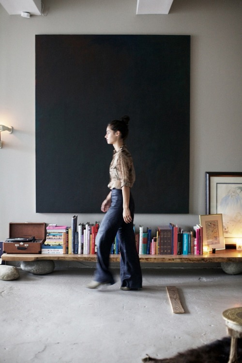
The obsession officially began when I saw the image of that complete stranger walking across her low shelf above. It seemed a perfect solution to a multitude of shelving quandaries - namely how a lot of shelves can be ugly. No offense to shelves. But...where would I find two large rocks like that, and how could I make them the same height? I had images of myself sanding rocks late at night, and it wasn't ideal.

Then, I found a much more reasonable DIY below. It's such a simple idea really: balance a refurbished plank of wood on top of a stack of magazines, and then you can have a shelf. Perfect.  
Image via Tumblr


Friday, December 6, 2013

WEEKEND DIY: LIGHTING IDEAS

Image via Bolig
I've been MIA lately. No particular reason. Thanksgiving, Black Friday, and/or Crazy Monday might have been involved. On the plus side, nothing has been able to stop me from browsing around in the online universe and - since unique lighting can really make a dramatic difference - I thought of some things it might be interesting to try with hanging bulbs, metal poles, and ladders.

I really like that kitchen above, with the lights strung across a metal pole and dangling down at different lengths. To be honest, I like the entire kitchen, the house, and the minimalist black and white decor, but since that's not happening, I'm just going to stick to pointing out the lights. So - the lights. Nice, eh?

Now below, if you can get your hands on an old stick ladder, you can wrap a light around it - and behold! Another light fixture. There are an infinite number of ways to add a little bit of light. That one's not bad, and the punk print's not bad either.

From March Collective

EASY WEEKEND DIY: STRING LIGHTS


This is the adult version of the Christmas lights I used to string up in my college dorm room way back when ago. And old habits die hard. Possibly you see a picture and the idea resurrects itself in the dark nether regions of your mind - should I do this? And more importantly - how?

The short answer is Yes.  Cup of Jo has thoughtfully provided the source of the lights as One Forty Three. Below I have thoughtfully provided a nice closeup of the more mature, adult bulbs involved. Do what you must. 
OneFortyThree

Friday, October 25, 2013

WEEKEND DIY: WALL BOX SHELVING


Photographer Petra Bindel
I'm not delusional. This is not at all easy and it may take forever - but this is an interesting idea: attaching boxes to walls to act as shelves, and painting the interiors to add a little bit of visual interest. There are two views here, from the front and from the side, to provide a little perspective. Takers?

Friday, October 11, 2013

EASY WEEKEND DIY: HANGING ART WALL


To be perfectly honest, hanging wall art isn't easy, and it probably will take more than a weekend and that will ruin your Monday. That said, I ran across Spain's Glamour website (I think - it's in Spanish and I don't speak Spanish, but I do speak the international language of interior design) and they have some very good ideas. Above, I really like the idea of mixing large and small art pieces, even if the smaller pieces are of insects and this may be the dining room.

Wednesday, August 14, 2013

THE BEDROOM IN YOUR DREAM


Fantastic Frank
I saw this bedroom a few weeks ago, and then I put it on Tumblr, and I thought that was the full extent of what I needed to do with it.  But sometimes, an image will grow roots in your head, it will stake out territory and sinuously draw your mind towards it.  So here we are.  I'm sharing. 

Certain images are pretty, I troll around enough to have met a few.  Very few have that power of pull.  I cannot explain or predict the ones that will, I can only point them out and say: "Look here.  This will make you feel something." Or something else just as eloquent. 

What do I like about this?  It's comforting, it's airy and light, and there are just a million little creative details that went into its creation, even though that goes against the grain for me (I don't like gross accessorizing) - I'm not going to point out what they are.  It's always more revelatory when you discover these things out for yourself.  When you put all these details together, they create a visual dialogue.  It says something to you, not in so many specific words, but in a language that touches your subconscious mind, and you know it, because you feel...something.  Again, I'm not going to define what that feeling could be.  This overall effect is what gives an image pull for me.  

I may be overanalyzing, but that's what I like to do.  Cheers!

Tuesday, July 23, 2013

IDEAL V. REAL: THE TV

Via
Oh, how I would love this.  Let's look at it from another angle.  See below.  Yes, that still looks beautiful.  The entire apartment is quite beautiful actually, if you follow the link.  There really is no end to good taste and what it can do for you.  

Via
Now, here's a touchy question that I sometimes struggle with...is this practical?
  
Because in reality, I don't have overwhelming large pieces of art that I can display, and I'm not sure that I would want a TV that low to the ground.  

Here is the larger problem: I'm addicted to aesthetics.  I follow interior design sites the way some people follow porn: In the dark.  Late at night. Alone.  I'm checking things out. 

Aesthetically speaking, a TV at eye level (where you can watch it easily and use it for its intended purpose) looks fairly unattractive.  Most TV stands I've found are 1) overpriced and 2) unattractive.  So it's like being screwed at two entirely different angles. 

Below, I included the most practical, easily accessible, commercially available, and least ugly solution from West Elm.  It's not the same as the ideal, but it's not hideous.  

In my own abode, of course, I have an bleh thing from IKEA.
West Elm


I'm not going to include a picture of my bleh.  Because it's bleh. 

I suppose this second option could look okay depending on what you put around it. My preference is to minimize clutter, to not have too much stuff, you know?  

Just the proper amount.  (See above)

Friday, April 19, 2013

EASY WEEKEND DIY: LEAF IN A VASE

Photo Courtesy of Old Brand New blog
Above is a pic from Oldbrandnewblog.com.  I like this blog for ideas and for the colors.  Sometimes there are simple things that I could actually do myself, such as that dramatic leaf arching out of a clear vase.  Perfect.

A Pair and A Spare also has a version.
Related Posts Plugin for WordPress, Blogger...